This case study explores the conceptualization, design, and execution of three distinct motion graphic videos created entirely using Adobe After Effects.
The featured projects include:
Google Gemini Promotional Video
Durham College PSA Orientation Video
Nike Retro
Client
Portfolio
Start Date
Mar 17, 2025
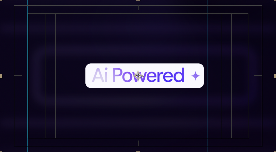
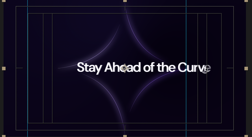
1. 🚀 Google Gemini Promotional Video (25 Seconds)
Objective: To create a dynamic, professional, and engaging motion graphic video that encapsulates the essence of Google Gemini, a leading AI platform. The primary aim was to boost brand visibility, enhance engagement, and visually convey a cutting-edge, professional tech identity.
Creative Direction:
Minimalist, tech-inspired aesthetic
Futuristic transitions and AI-inspired iconography
Smooth kinetic typography to highlight AI capabilities
Custom UI elements designed to showcase machine learning and language understanding
Design Elements:
Monochrome base with Google’s signature color palette (blue, red, yellow, green)
Animated waveform and neural network visuals
Particle effects and glows to simulate data processing
Outcomes:
Highly shareable promotional content optimized for web and social
Reinforced the perception of Gemini as a powerful, sleek, and trustworthy AI platform
Client Brief & Objectives
The client required a clean, visually appealing, and impactful motion graphic video that could be used across various digital platforms to promote their brand. The primary objectives were to:
Highlight the brand's core values and key offerings.
Engage viewers quickly with a short but captivating visual story.
Ensure visual consistency with the existing brand guidelines and style.
Maintain a modern, clean aesthetic while integrating motion graphics to enhance storytelling.
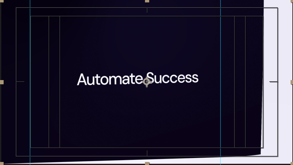
. 🎓 Durham College PSA Orientation Video
Objective: To produce a public service announcement video to welcome and inform new students at Durham College, making them aware of important safety protocols, student services, and campus facilities.
Creative Direction:
Clean, professional layout with strong typography
Icon-based animations for clarity and accessibility
Friendly and inclusive tone with a visual style that's both informative and modern
Design Elements:
Use of Durham College green and white branding
Motion-graphic map of the campus
Animated infographics for services like mental health, IT helpdesk, and academic support
Outcomes:
Enhanced student engagement during orientation week
Provided clear, accessible information using motion design
Supported the college's brand image as welcoming and resourceful
3. 🏀 Nike Retro Style Video
Objective: To develop a nostalgic yet bold motion graphic video for Nike, inspired by 80s-90s retro aesthetics, targeting Gen Z and millennial audiences who connect with vintage street culture.
Creative Direction:
Energetic and bold kinetic typography
Grain textures, VHS distortion, and RGB color splitting
Retro grid animations with classic Nike silhouettes
Fast-paced animation synced to a retro hip-hop beat
Design Elements:
Neon color palette with glitch overlays
3D camera movements to simulate handheld camcorder footage
Retro Nike logos and product frames
Outcomes:
Captured the brand’s deep-rooted cultural influence and heritage
Created buzz on social media platforms like Instagram Reels and TikTok
Positioned Nike as timeless and relevant across generations
Creative Process & Concept Development
Initial Concept: The initial brainstorming and creative sessions with the client helped define the core message of the video and its tone. The video needed to capture the viewer's attention in the first few seconds and communicate the brand’s message without overwhelming the audience.
Storyboarding & Planning:
Storyboarding was created to visualize the flow of the video, ensuring that key points like product features, brand identity, and call-to-action were placed in the most impactful areas.
The storyboard included transitions between scenes, motion techniques (e.g., kinetic typography, shape animation, and subtle 3D effects), and the color palette.
The script was developed to ensure that the messaging would align with the visuals and tone of the video.
Brand Guidelines: All design elements, such as fonts, colors, and logos, adhered to the client's established brand guidelines to maintain consistency with their existing visual identity.
Execution in After Effects
Animation Techniques: The video used a combination of the following techniques:
Kinetic Typography: The text moved dynamically across the screen, emphasizing key messages and making the content more engaging.
Shape Layers & Motion Paths: These were used to create fluid transitions between scenes, enhancing visual appeal and storytelling.
Parallax & 3D Effects: Subtle 3D layers were incorporated to create depth, adding complexity to the video without overwhelming the viewer.
Smooth Transitions: Smooth fading and sliding transitions helped maintain the pacing of the video while keeping the visual flow continuous.
Visual Style: The video used a minimalistic, modern design approach with clean lines, contrasting colors, and sharp, angular shapes that fit the brand's modern and professional image.
The color scheme was kept simple with a focus on bold primary colors and white space